Web Design Trends: Flat UI
13 years ago
2 comments
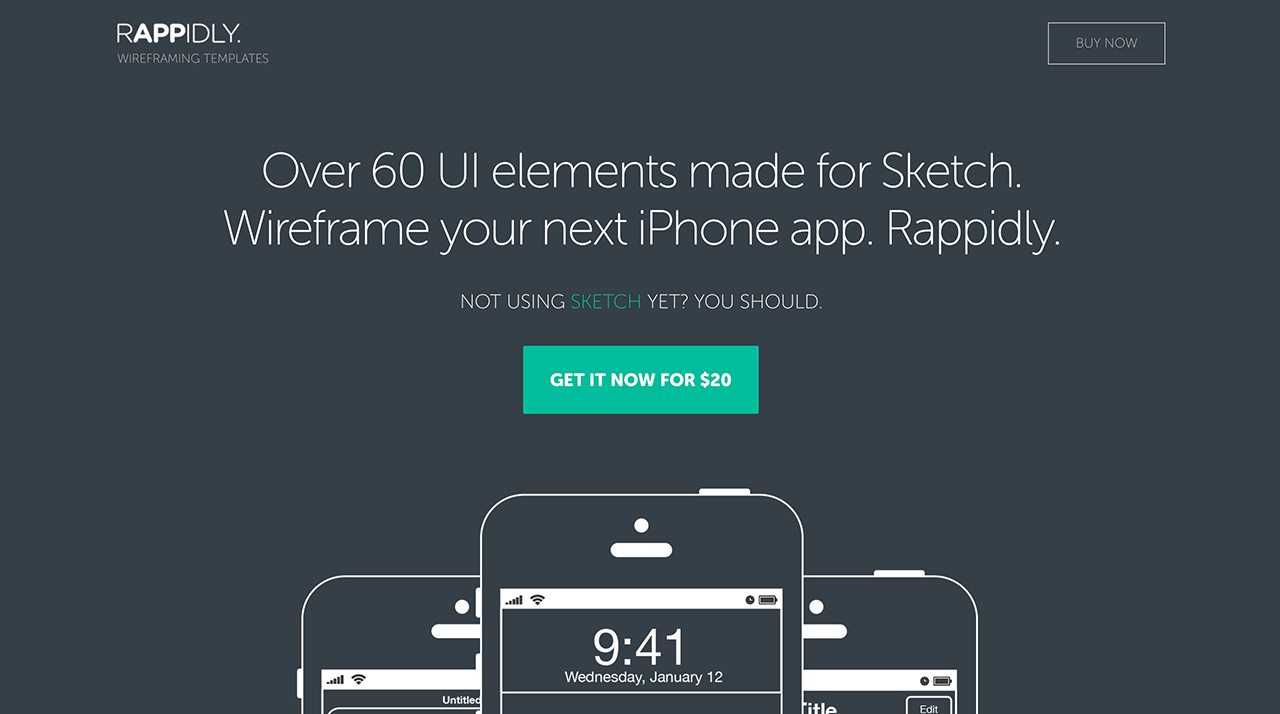
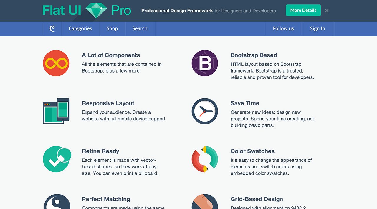
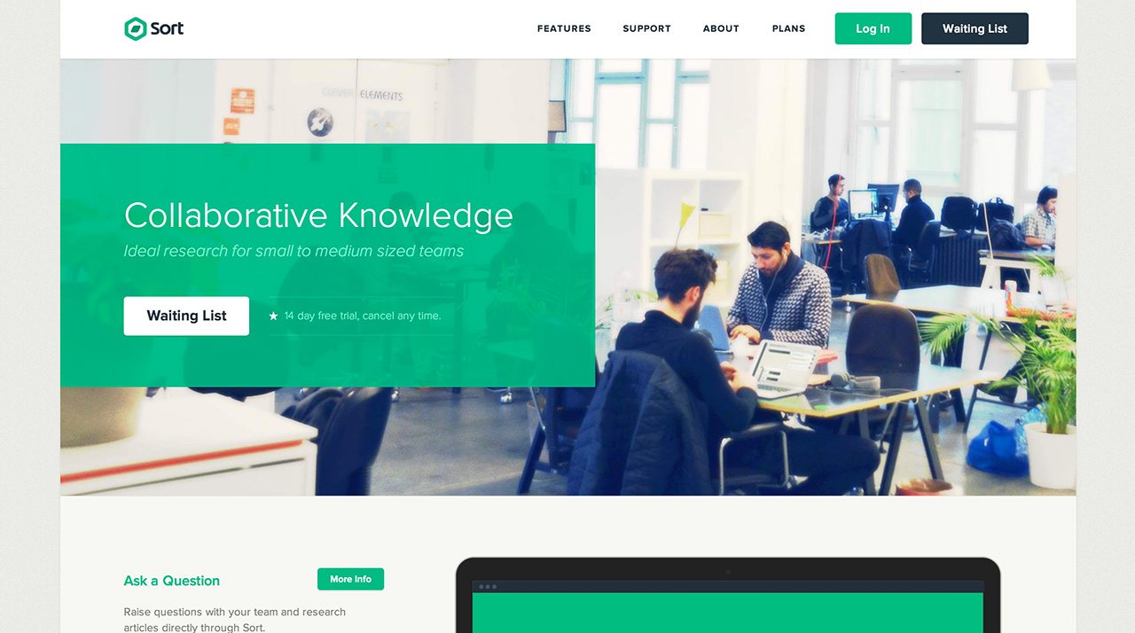
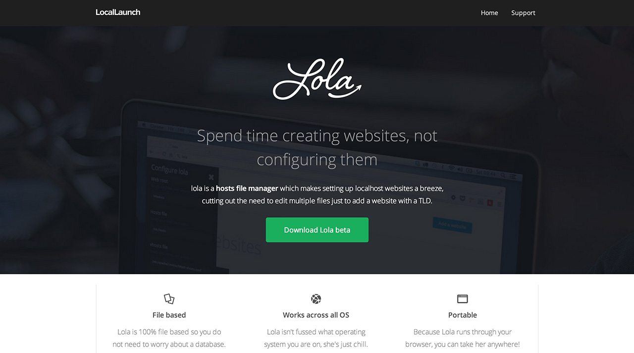
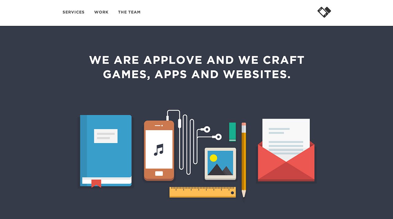
We all know that trends come and go, look at the 60s, I mean apart from the clothes coming back in fashion every few years then fading away the advertising industry see’s trends float around in and out. Todays trend in web design that is catching everyones eye is Flat UI, to me flat UI is just web design from the early 2000s using vintage colours from the 50s and 60s. What are your thoughts, is it a trend to stay around for a while? Or will it come and go like the sunrise each day. Here is a showcase of my favourite uses of Flat UI in web design.
Hi Alec,
You are most welcome, it is a very nice example and really well designed site.
Hey,
Thanks for putting Lola up :)
I like what you say about flat design, I might have to try the 60′s approach on my next project.
I don’t think gradients and shadows have lost their place, i think it depends on the designers opinion and what solution they think is appropriate for the brief.
But I do think flat UI will be around for a while and really has a place in the future of web/app design.