New twitter layout & what it means for your custom backgrounds
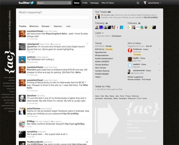
Late last year Twitter announced the launch of a completely new design. As of today those of you who still do not have the new Twitter 2.0 layout will be getting it very soon. Today I want to let you know about what you can do to fix your custom Twitter background so that it works well with the new layout. Twitter made the new layout much wider that than the previous layout version, this means that on smaller screen sizes you are going to have your cool left side graphic and details (seems to be the most common design layout so far) hidden under the #page-container.
Don’t worry to much about it though, all you need to do is to modify your design to fix on a resolution of 1280 x 1024 if you are not to concerned about a screen resolution that small then don’t worry about it too much because at monitor resolutions of 1440 or wider, your current background should still look sweet, you may need to adjust the left side graphic if you have one a little bit.
Another cool thing I noticed was the semi-transparent effect on the right side column, I had the thought of putting some info here so it slightly comes through, just remember that transparency will only work in Firefox, Chrome, Opera, Safari, and IE9, all previous versions of IE lack support for CSS3 and will not be transparent.
Have a play around with your new layout and see what you can come up with. This is the new one I made this morning after switching to the new layout.
